Looking back at some of my early web design work, it shows just how fashions have changed in web over the years. Gone is the fascination for gradients, background images and pixel perfection.
Vector images
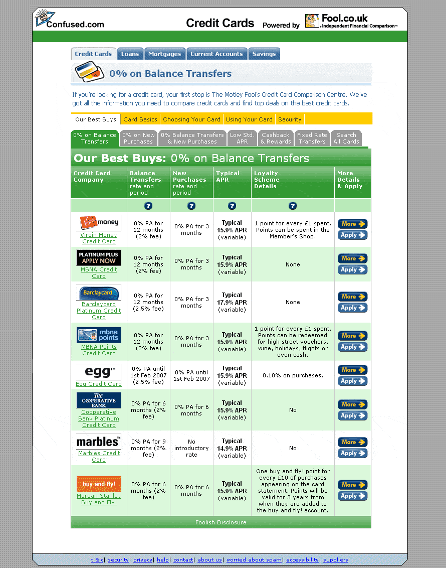
My web design work for fool.co.uk, involved lots of vector image creation, such as icons and bevelled buttons. These were then used on the main website, within email newsletters or skinned for use on third party sites. Here’s are a few examples for comparison site confused.com.
Confused.com – early 2006
With narrow desktop screen widths, it was often difficult to display the volumes of information required in such a small space. Financial information was rarely abbreviated (font sizes were sometimes defined by the FSA), these pages also contained a lot of SEO text, whilst having to fit the dimensions of an iframe or surrounds of the third parties’ website.
Confused.com – Aug 2006
Heading / sectioning headers were later introduced later in the same year. They have aged reasonably well, although they were sometimes a bit too modern for the third party site.
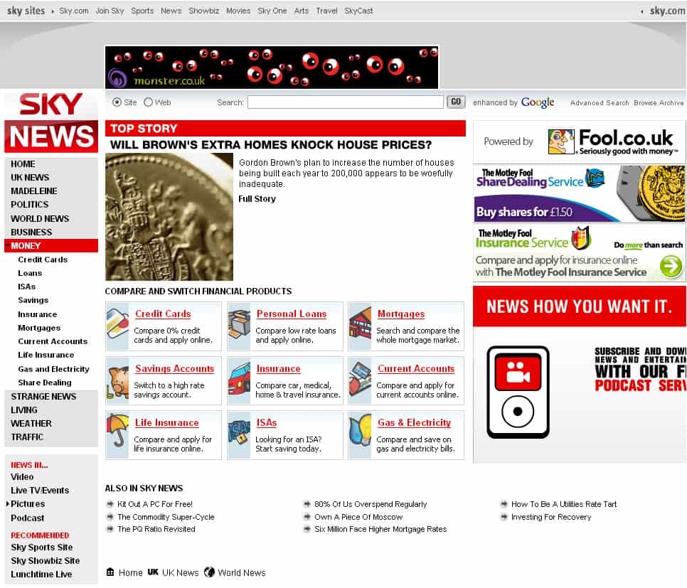
Sky News – early 2007
An example from Sky News’ money page, featuring Fool.co.uk’s comparison centre icons and Share Dealing adverts.
Much of the partner site work involved using XSLT templates that called a theme CSS skin, buttons and background images.
Partners included; GoCompare, Compare The Market, Virgin Money loans, 77Finance and Confused.com.
