Responsive web design has been THE big thing for the last few years, with separate m sites being phased out in favour of the more maintainable one codebase for all. Fluid content and layouts are much more futureproof, adapting to devices and screens in theory still not on the shelves. Frameworks such as Bootstrap and Foundation have been hugely popular, but applying these skills to Magento hasn’t been easy.
Magento is a beast in terms of the volume of layout and template files needed to run each store, so making changes to each of these (for example to add Bootstrap responsive markup) would always be an upgrade nightmare. Similarly, Magento is already quite weighty in terms of page load with a host of individual js, css and image files being loaded on each page. So introducing additional libraries that are not core, is rarely worth the aesthetic gain.
Magento CE 1.9 responsive theme
However today Magento announced core theme changes with the release of Magento Enterprise Edition 1.14 and Magento Community Edition 1.9. In the blog ‘Magento Enables Responsive Sites in Half the Time‘ they state;
Magento is changing the mobile commerce landscape by significantly reducing the time and cost typically required to get a responsive site, and by making it easier than ever for merchants to take advantage of the rapid growth in mobile commerce.
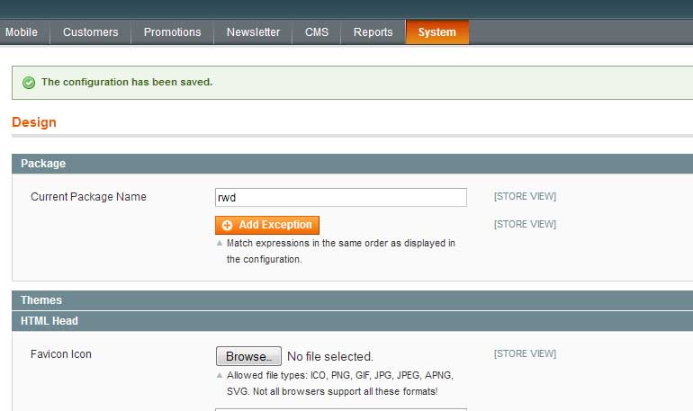
So on a demo site, I thought I’d road test the new responsive Magento CE 1.9 theme ‘rwd’. To do this yourself, upgrade/install CE 1.9. Then go to System > Design > Package
and add the new theme name rwd
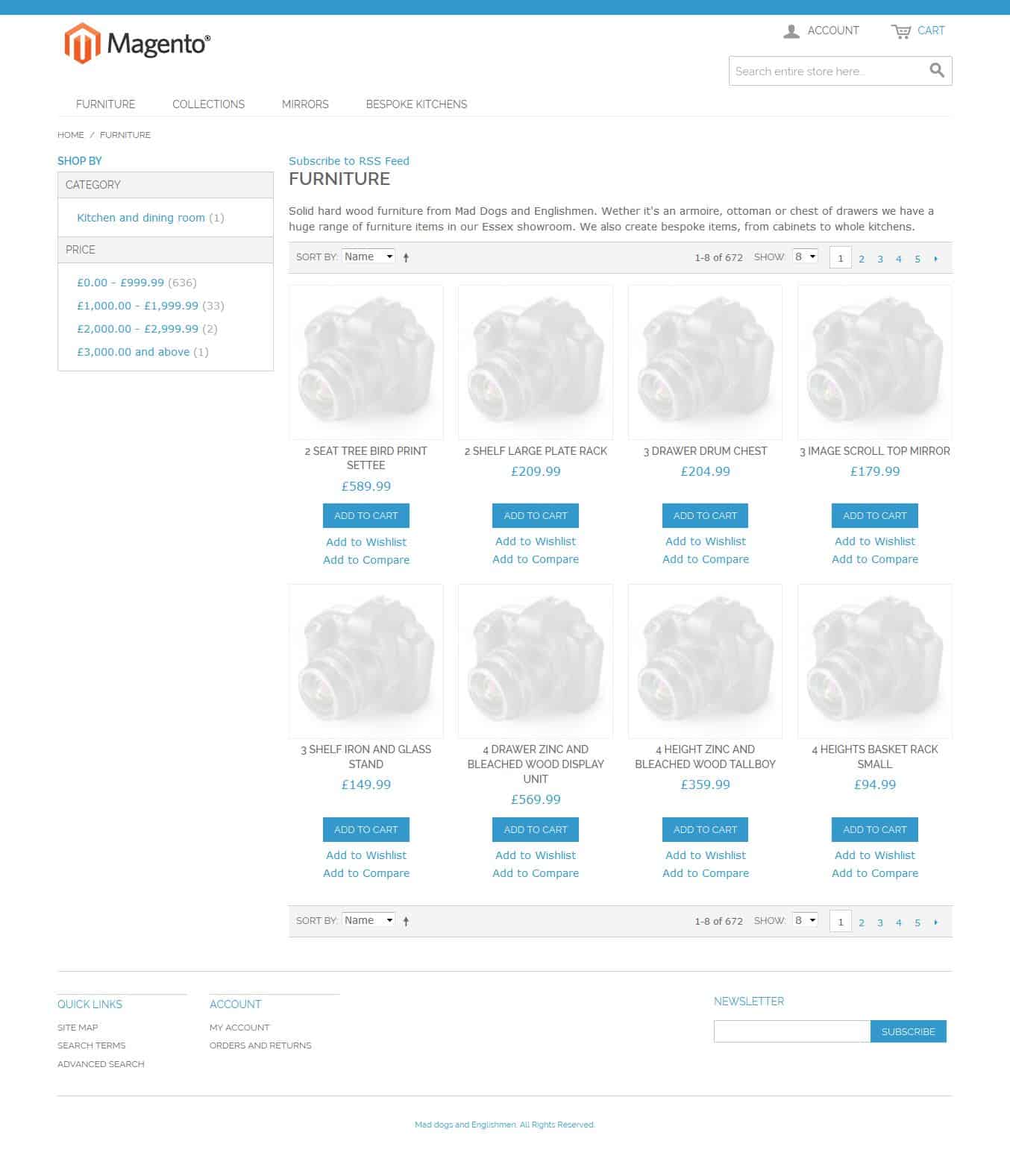
Magento responsive theme – landing page – desktop/large
As you’ll see on the large view of the product landing page, the text, buttons and spacing is all much bigger.
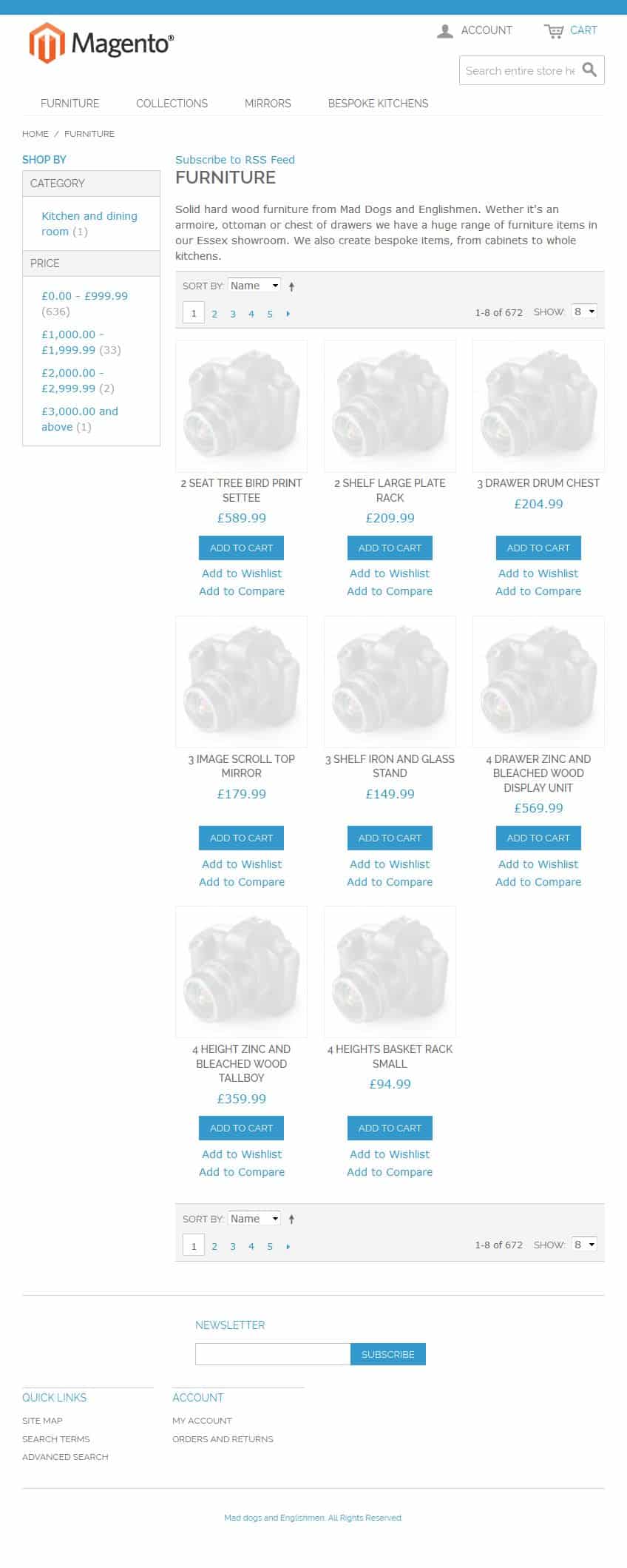
Magento responsive theme – landing page – tablet/medium
In tablet view, the grid layout automatically changes from 4 to 3, with the images getting slightly larger. There is still quite a bit of clutter that can be removed with a child theme, but this is a massive improvement on the previous default Magento theme.
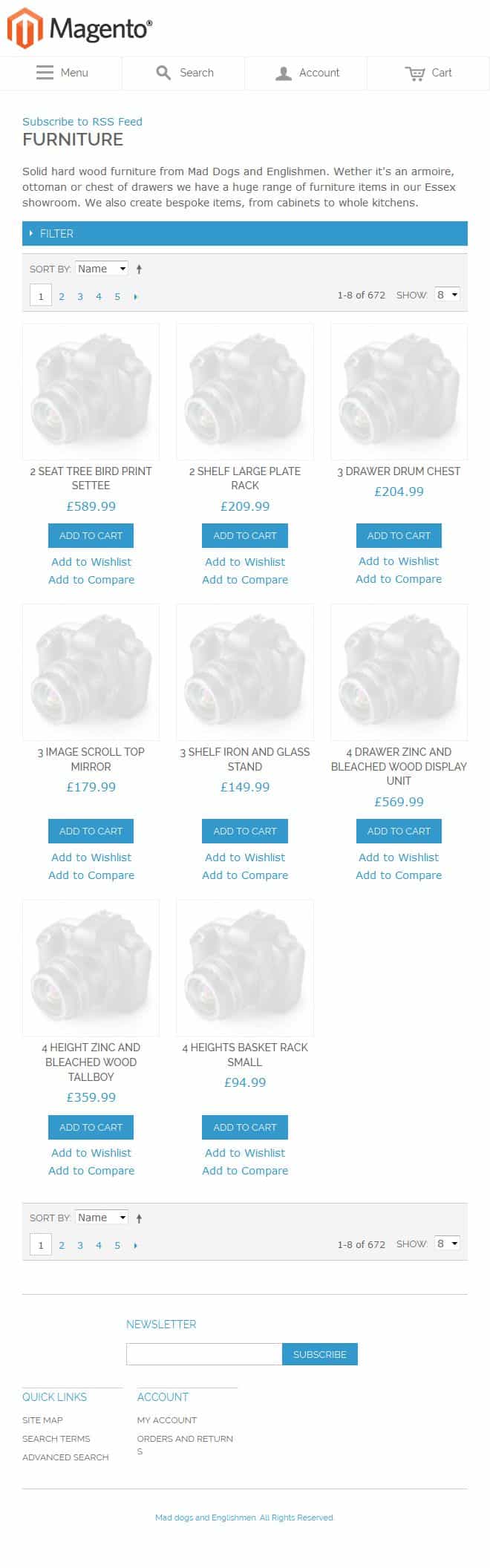
Magento responsive theme – landing page – mobile/small
Viewed on a mobile, the left hand filter nav moves up above the product grid.
Magento responsive theme – product page – mobile/small
Again much cleaner and easier to use, with big text and buttons.
Magento responsive theme – shopping cart page – mobile/small
We also have some nice event flagging, such as when products are added to the cart / shopping basket.
Sorry that this isn’t an in depth review, but I now plan to use this on an ecommerce site revamp, so after I’ve looked under the hood and kicked the tyres a bit more I’ll report back with another post.


Hi
Great overview of Magento 1.9.
We’re currently in the making of creating a responsive theme for our website. We’re using the GPMD template for this ( https://github.com/gpmd/magento-responsive-theme ), and I was wondering if it would be better to base the site on the new magento responsive theme instead?
Before we put too many hours into the GPMD – what’s your point of view on this?
Thanks Michael, I’ve not used the GPMD responsive theme but see that it’s based on the much older base/default theme. I went on to test the rwd theme for the site http://www.lovethywall.com/ , adding a theme SASS file and importing a few useful Bootstrap mixins to better customise the homepage. There’s quite a bit of refining still to do but rwd has so far worked out very well.
Hi,
Thank you for great instruction of Magento 1.9
I have some questions.
If I want to change image at the bottom of header(menu) in responsive page, what should I do?
I mean how I can do for preparation of responsive page.
I’m using larger image there in browser page than in responsive page.
So if I see my homepage by smartphone, it will be displayed with get out of position a little bit because of larger image.
Please help me about that.
Thank you.
Hellow sorry i just download magento CE 1.9.0.1
I don’nt know show products in the new home page, Can you help me, please ??
Hi, I am first time user, how to change the blue color to red color? appreciated!
Hi Joseph,
I’m not sure how advanced at front end dev you are, but the theme uses .scss files to compile the css http://sass-lang.com/guide, which dictate the colours and styles used. If that’s all too much you can make changes directly to the css/styles.css file replacing #2a92e5; (blue) with say #D43A3F (a red). It’s much better to go down the SASS route, as your changes will be lost if you ever compile the theme’s .scss files. You also lose all the great benefits of SASS.
Thanks
Andrew
magento 1.9 theme is great.
Hi, thanks for the write up. After creating massive PSD files for custom Magento store it look like we would save a lot of time and aggravation by creating PSD files that follow the existing Responsive layout as closely as possible. I just wish we had done that a year ago. Now we need to create PSDs for the Responsive design and Im looking for some dos and donts before spending hours on the new designs. A “do’s and don’t” list would be a great topic for the new Magento CE 1.9.
Thanks, Marc